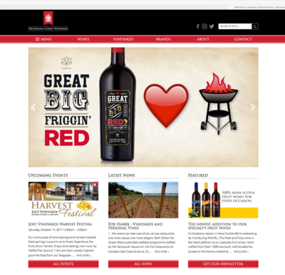
Great Big Friggin’ Red


Marketing
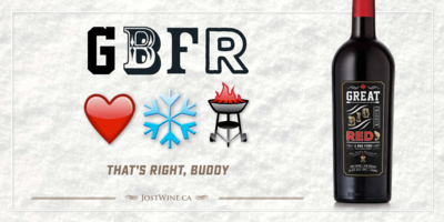
With product placement and marketing support from the NSLC we complemented their efforts with a full marketing campaign including print and outdoor advertising, collateral, in-store materials and an online and social media campaign. The success of the limited run launch led to GBFR being a standard listed product which lead to extending our campaign into the winter.


design & packaging
To emphasize the brand attributes in the packaging we chose a striking red cap. The confidence in emphasizing the red in a Nova Scotia red paramount. The bottle is a heavy forte style bottle with an old-school branded cork rather than twist off closure. The colour palette is restrained to emphasize the typography as the name is the driver of the visual identity. Gold foil is applied strategically to impart a premium feel.
GBFR has become the number one selling Nova Scotia red wine only a year after its initial release.

